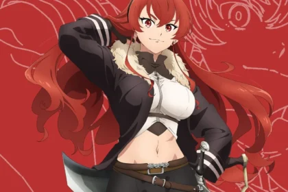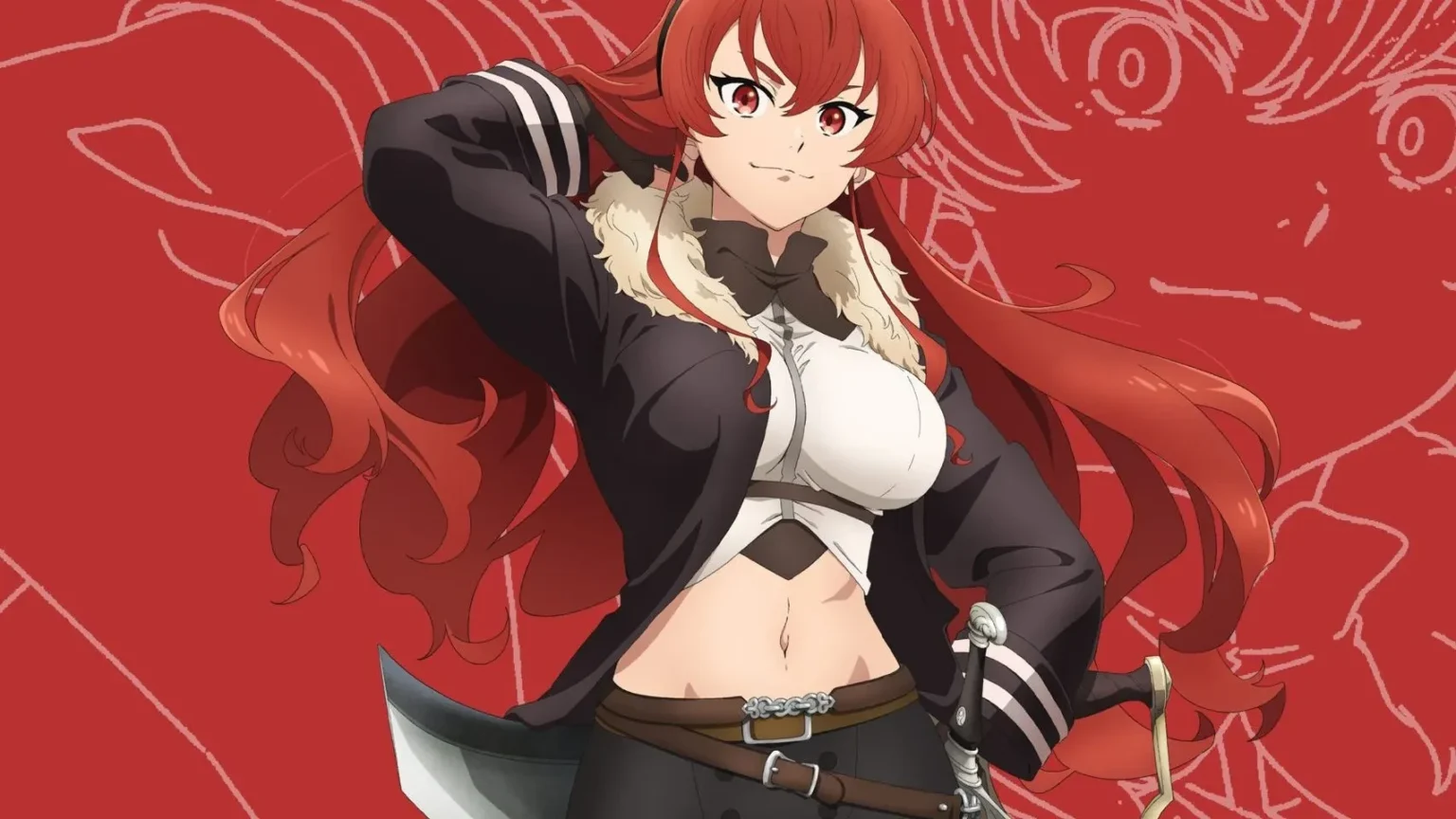
The premiere is getting closer, and the fandom already has material to debate. With the official launch of a visual with the design of Eris Boreas Greyrat For the third season of Mushoku Tensei: Jobless Reincarnation (d)Mushoku Tensei: Isekai Ittara Honki Dasu), scheduled to release July 5, the fans did not take long to put this new version with the one that appears in the original light novel.
Who is Eris Boreas Greyrat?
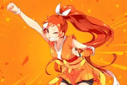
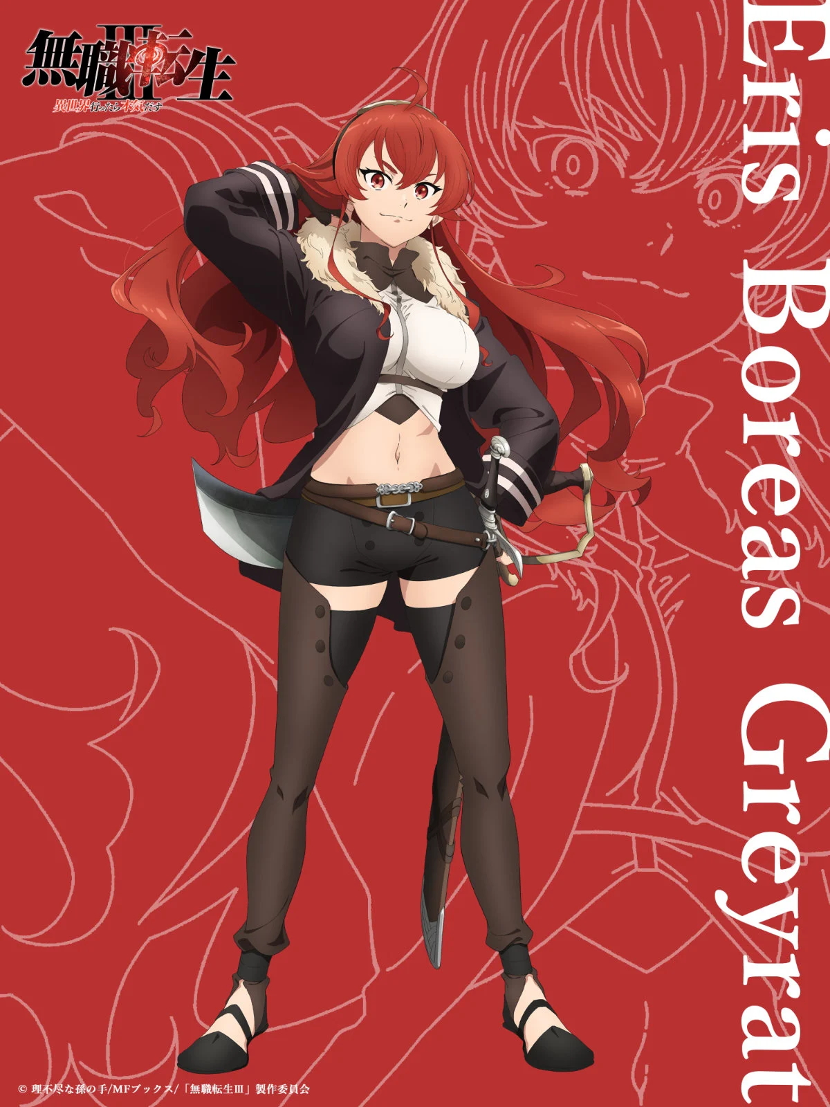
For those who do not follow the series since their first seasons, ERIS He is one of the central characters of Mushoku Tensei, introduced from the first arc of history as the protagonist’s sword student, Rudeus Greyrat. Throughout the narrative, ERIS She goes from being an impulsive and temperamental girl to becoming a formidable warrior, one of the most recognized character growth arcs in the entire franchise.
Its physical and emotional evolution throughout history has been one of the points that follows the fandom the most, precisely because season 3 corresponds to an advanced point of the timeline, where the character is already considerably greater than in its first appearance, which explains why its updated design generates so much conversation.
What changed in the Eris design for Season 3?
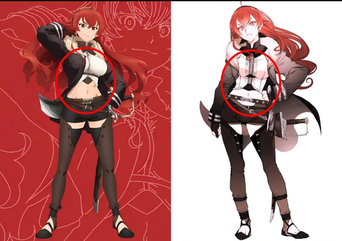
According to the comments that circulate among fans, Eris’s new design in its adult version is notably more striking than that of previous installments, in an aesthetic direction that several viewers describe as an obvious leap regarding how the character was represented in the original light novel. The picture-by-image comparisons between both versions went viral almost immediately after the official disclosure.
This type of comparison, anime against original material, is common when an animation studio has to make design decisions that the written text leaves more open to interpretation. A light novel describes a character with words; An anime has to translate that description into a specific visual design, and that interpretation process is exactly what the fandom analyzes with so much detail every time new promotional material is revealed.
Why does the fandom pay so much attention to these details?
The design comparisons between the original material and its animated adaptation became a common practice within the anime community, especially in series with fandoms as active as that of Mushoku Tensei. Each new preview, promotional image or key visual is analyzed in detail, comparing proportions, costumes and style with respect to the original illustrations of the light novel or the manga.
Each new advance, promotional image or key visual is analyzed in detail, comparing proportions, costumes and style with respect to the original illustrations of the light novel. This level of scrutiny is not exclusive to this series, it is part of a broader conversation within the anime fandom about how the studios interpret, and sometimes reimagine, the visual design of the characters when animating them. Similar cases of debate on character design between seasons have recently been seen in other large-scale franchises, suggesting that this kind of comparison has become an integral part of how the modern fandom consumes every new production ad.
What’s coming with season 3
With the premiere set for July 5, the third season of Mushoku Tensei It continues to generate expectation within the Isekai fandom, one of the most active and commercially successful genres of the current anime. The revelation of this design adds to the promotional campaign that the production has progressively deployed on social networks as the release date approaches, and it is foreseeable that more advances, trailers and additional visuals will arrive in the coming weeks before the official launch.
For fans who have followed ERIS From its first appearance to this new stage of the story, seeing its updated design is also a way to measure how far the complete narrative of the series has advanced, which continues to be one of the Isekai adaptations best valued by critics and the public within the genre.